Pages

Tuesday, 4 May 2010

Conclusion

This project has taught me new skills in 3ds max. These skills include: Bipeds, Skinning, lighting effects, Animating, Lip syncing, adding sound and Adobe Premier Pro. Although I have allot to learn I think I have come along way from the last semester.
There are a few things that I would probably do different in my animation if I had the chance, the first is that I would of likes of used more camera angles in the scenes, also it would of been nice if the cameras paned in and out for close ups. As I had no knowledge in this I felt I would only use it if I had time but unfortunately I didn't.
The Bear Character was apart of my original sketches and story but because of the lack of time, I had to cut him from the story. The Bear was going to add a bit comedy to the scenes and also showcase a few more animating skills, but sadly it wasn't to be.
Overall I have enjoyed this module and I'm quite happy with the outcome of my animation, four months ago when I was struggling with my Old man model and I thought that I would never of achieved a finished piece of work, so I'm pretty chuffed!

Final Render

To complete my animation I needed to connect my four scenes together. I did this by using Adobe Premiere Pro to make one MP4 file. There was just a couple things I needed to add : A title Screen, A End screen and I also needed to fade the Animations and sounds in and out so there wasn't a sharp start on end to any of the scenes.


I wanted to keep the intro/outro as simple as possible so that it made more emphasis on the animation. I choose a font that I felt matched the feel of the story and then just gave it a plain black background. In the outro I faded in the main moral on the fable which I think finishes of the story well.


Thursday, 29 April 2010

Scene Four - Finish

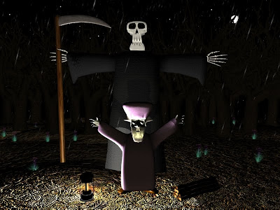
The first thing I noticed with my final scene was that Death's hands were grey and not white??? I realised that because I used a plane to make them the bottom of the plane goes transparent. What I had to do was to open the material editor and go to the 'Shader Basic Parameters' window and select 2-sided.


I pretty happy with how the scene ended up because it turned out to be the trickiest one to do. I particularly like the menacing looking trees when they light up with the thunder and lightning.


Scene Two - Finish

To finish scene two I decided to add a few quotes for the old man so the scene wasn't to boring. When I went to render the scene it said that it would take 35 hours!! So it went back to investigate. I found out that by turning of the shadow effects on my lights shortened the time considerably.

Monday, 26 April 2010

Scene Four - Part 3

The Old man needed to be animated now. The scene starts with him with his head bowed down, so the first thing was to lift his head up, then both of his arms. This was were the character cries out for death to take him away. I then had to lip sync his month to match the speech in the curve editor.

Next I had to line up the mouth so it looked straight and apart of the Old man's face. This was quite hard because when the head lifted the mouth would disappear into the beard. I combated this by positioning the mouth a slightly in front of the beard.


Once I had finished the syncing for the first sentence I realised that his mouth looked more happy than sad. Once I had rendered the animation it didn't notice so much because the mouth changed quite quickly so I left it in.

The second part of the the Old mans voice-over was a little more trickier to do because the Old man head is moving while he is talking. This caused the mouth to move out of place allot, this was because the mouth was linked to the biped which didn't move totally tangent with the beard.


Scene Four - Part 2

The lighting is this scene would play a big part in creating the atmosphere that I wanted. There would be 4 lights which would make up the gloomy feel to the woods.


My original idea was to have Death rising from the ground behind the Old man but I thought it would be quite nice if he appeared suddenly when the lightning struck. One second he wasn't there the next he was kind of thing. But this was proving hard to to because the scene had to be virtually pitch black for this to work. This wasn't viable because I wanted the Old man's face to be clear because he was going to talk. So after a few experiments I decided to revert back to my original idea.


The four lights included were: An Omni light for the lamp which made the characters show up better. A Target Directional light which made the Old mans face brighter so that you could see the lip syncing better. A Omni light in the sky that acted as the moon light to brighter the scene up slightly and an Omni light also in the sky which comes on and off very brightly when the thunder sound is heard.


The Scene was complete with the introduction of the logs, lamp, scythe and the rain.

Scene Four - Part 1

The wood floor was made with a Quadpatch and then with an Edit patch modifier to make the floor a bumpy. I choose a dead leaves texture to cover the floor, because this would match the Autumn feel to the trees.
The trees would make up the background the my scene, these would give the scene a scary dark feel to it when combined with the lightning effects.

The woodland floor still felt very 2D to me so I added some plants from the AEC Extended section in max. This was to give floor a bit more life. Next I needed to put my characters into the scene. I referred back to original storyboard which showed Death as a shorter character, I wanted to change this and make him bigger which would be scarier, this would make him look very mean and empowering.


I had a bit of an issue with Deaths hood, for some reason the hood was see through!! Hopefully when the the light effects are added this wont show up.


Scene Three

Scene three tries to make you feel that the Old man has finally given up on his hard life. He's wet tired and generally fed up. The scene will be shot as a close up of his face so there didn't need to be much else in the scene. I left a few trees around him but I didn't want them directly behind his head because I wanted him the stand out, and not to make the background too busy. I added the Lightning effects and the rain & thunder sounds. I also made use of the light coming from the Old mans lamp to create some nice shadows over him.


I recorded the Old mans voice and then added it to the soundtrack, the next thing I needed to do was to lip sync the the speech with his mouth. This was done but using the Track view - Curve editor to get the syncing just right. I kept the mouth nice and simple so it showed up as clear as possible in the dark atmosphere.


After syncing his mouth I animated the Old mans head slowly shaking from side to side, like he was sad and fed up, I then had him bow his head which matched the start scene 4, where I was going to have him start the scene with his head bowed.


I originally wanted to animate the Old mans eyes and eyebrows but when I tried to do this the objects were not animating! They kept on ignoring the new position I was putting them into which became very frustrating so I left it. If I find out a reason for this problem I might go back and change it. But overall the scene achieves what I wanted, the sense of unhappiness and despair from the main character.


Scene One - Finish

My first scene was nearing completion. The smoke for the chimney needed to be added this was done by producing 4 cones and adding some modifiers to them these were: Edit mesh, Mesh select, Flex, Noise and Bend. These modifiers all contribute to make the smoke effect look like it is rising from the chimney.

Next the smoke needed to fade out due to the fire running out of wood, this was done by scaling the cones down while in animation mode. The smoke needed to disappear when the glow from the window also faded out.


The final part of the scene was adding the Old mans voice. This was done by recording my own voice on a Edirol R-09HR 24bit Wave/MP3 Recorder. Once I had recorded the phrases that I wanted the Old man to say, I then added them to my original Thunder and rain sound track using Adobe Soundbooth. I also added a few footstep samples to the scene which made the scene more realistic, this gave the impression that the Old man was walking through his little house stopping to open the front door and then heading of to go collect the wood.


Wednesday, 21 April 2010

Scythe & Sticks


There were a couple of props that i needed to make for my last scene, these would be quite simple to make. First was the scythe that Death would hold as he rose from the ground. This was made by finding a reference picture of a scythe and attaching it to a plane. I then made the handle from a cylinder and created the blade from a thin box. I gave the handle a wooden texture and a UV modifier to make it look real. And for the blade I gave it a rusty metal texture and also raised the specular and glossiness levels to make it look more like metal.


The wood was needed for when Death arrives and the Old man cheekily asks Death to help him carry them. They were made by making a cylinder and adding a Noise modifier to make the logs look uneven and knobbly. I used another wood texture of the diffuse and bump maps to create a realistic look and then I copied the logs and stacked them together so them looked like a pile.


Death - Biped

The first thing I wanted to do was to hollow out the sleeves so the wrists of my hand models would look better disappearing inside the cloak. I used the same method as I did with the hood but this time I had problems with the Smooth modifier! For some reason the Turbo Smooth and Smooth modifiers had issues with me cutting the model like this so I left it how it was as hoping that it wouldn't notice.


I then created I biped for death which fitted the size of the cloak.


The hands and skull were attached to the biped using the skin modifier separately and then I added a skin modifier to the cloak. The main purpose was to get the arms and hands working properly because Death wasn't going to walk anywhere in my scene but he may move his arms.

This is the final model of my Death character. With working arms and head.


Death - Hand


I stated with a picture of the outline of a skeletons hand and then created Planes which roughly fitted over each bone. I then used the select and move tool to shape the bones. Once the model was made I used the extrude tool to give the hand depth. Lastly I added a Turbo smooth and the same materials to the hand as i did to the skull to make it look more realistic.


The hand turned out quite good, all I will need to do is to duplicate it for the opposite arm and there done!

Death - Skull & Cloak


To hollow out the hood for deaths cloak I used the cut tool to make a new edge around the hood parameter then I selected the inner polygons and then deleted them.


I then added my skull to see how it looked. There was a slight problem with hood now which had arisen since I had made the change. The problem was that the turbo smooth modifier was effecting the neck part of the cloak, it rose up a bit and wasn't quite right. I tried to move some 'verts' to correct it but it didn't seem possible.


I decided to take the Turbo Smooth away and add just the Smooth modifier which made the problem go away but i had a dilemma because the Turbo Smooth makes the hood look more natural.


This is the cloak with the Smooth on is looks o.k because the cloak doesn't have to look totally realistic because of the cartoon style. I also added a fabric bump map to the cloak and a dark grey colour. I didn't want to make the cloak too dark because I wanted it to stand out a bit in my scene.


Death - Skull

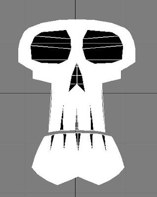
The skull was modeled from this cartoon picture. I started with a box then using the editable poly modifier I deleted some polygons so get a basic shape of the skull next I moved the 'verts' to shape the head. I then used the 'verts' to shape the eyes and nose, next I deleted the polygons to make these features hollow.


Once I had sculpted the skull I chose the side of the head that looked best and then deleted half of the skull so I could use the symmetry modifier to make the skull symmetrical. The teeth were made by using the cut tool and deleting the triangular shapes out of the jaw. The Skull would be buried inside the hood of the cloak so I didn't have to worry about the back of the head. I also left the skull face flat which wouldn't matter because the scene will only Death from the front.


To finish the skull I found a bone texture and used it in the diffuse and bump maps in the material editor. I also pushed the self illumination up to give the skull a ghostly glow in the dark look. Overall I think it came out quite well and should look effective in the darkly lit scene.


Death - Cloak


I now needed the make my Death character. I started by using my original sketches that I drew at the start of the project. Firstly I placed the pictures on to two planes and froze them so that you could see both angles of the character next to each other. I started with a box which covered the torso of the character and then changed it to an editable poly. Here I moved the vertices so that they matched the outline of my drawing.


I found out while making the Old man character that you only have to concentrate on one side of the model so I did this with the side of death with his arm sticking out.

In my initial drawing I didn't put any detail in deaths face because I wanted him to look quite menacing but I was thinking to animate the death talking if i had time so i needed him to have a mouth. I looked for an appropriate skull on the web and found a cartoon skull that would probably work well because it fitted well on to my cloak and also look quite evil, but fun! I created a new plane and added the skull to it, this was to get the shape of the hood right.


To finish the cloak I added a symmetry modifier and then finally a turbo smooth modifier. I would now have to think about hollowing out the hood and the sleeves.